My Adobe InDesign Cheat Sheet
One of the companies I work for has me build and publish a catalog for them about once or twice a year. I hear that Adobe’s InDesign is supposed to be great for this! But I find the InDesign tools less intuitive than those in Illustrator. So each year I start out in InDesign, picking up a few new skills and seeing if their interface feels more familiar or has become more user-friendly. … In the end I always switch back to Adobe Illustrator because when it comes down to it, I work faster and more efficiently in what I am familiar with.
That said … I think this will be the year I officially make the leap and publish a catalog in InDesign! I have picked up a nice little set of skills to get me started. I am sure that I will pick up more as time goes on. But for now, here is my cheat sheet so I don’t lose what has already been found:
Master Pages and Multiple Master Pages
 The purpose of a single Maser Page
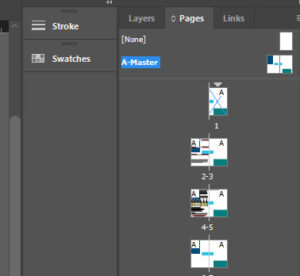
One of the things that caught my attention with InDesign was “Master Pages”. Similar to how I use PHP to make sure that my hand-coded pages have consistent headers and footers, InDesign has “Master Pages” where you can set certain elements on a 2-page spread and that design is copied to EVERY page. Specifically I use Master Pages to make sure that the bottom of each page contains a colorful border and company contact information.
Notice how the rectangles that I put on my “A-Master” sit in the background of each following page. I can add additional text, images, and other elements on top of these master pieces.
Annoying part – The master stuff shows on my Page 1 cover too. Since the Master content is in the background, I will simply drop a large image and text in front of it.
Multiple Master Pages
Master pages are a nice way to keep things consistent. But sometimes you want to break your catalog into sections, each with their own style. … A warming red to set the mood for a comforting hot drink in the fall. Refreshing blues for the water line.
it makes sense to break the catalog down into sections. Different color schemes and styles can reinforce branding or help to set the mood for a product line. The catalog I am working on now will be published in the fall. I want to use a warming red color scheme in the sweeteners section. They have a strong water line with its own blue color scheme and a minerals line that I think would be well represented with the black.
But what if I wanted my master pages to be in front of the content?
Page Numbers
Consistent Text Formatting
give headers and such a name. t urnoff ligature.
